
RESPONSIVE WEB DESIGN
Responsive Web Design – Flexible And Fluid Website Design for Mobile Devices, Tablets and Desktop Computers
Responsive web design involves an approach that adjusts the layout of a website based on the users’ screen size, platform, and orientation. Using a combination of flexible imagery, typography, and grids, a responsive website detects the screen dimensions – be it a tablet, desktop or mobile device – and alters the layout to maximize legibility and user experience.
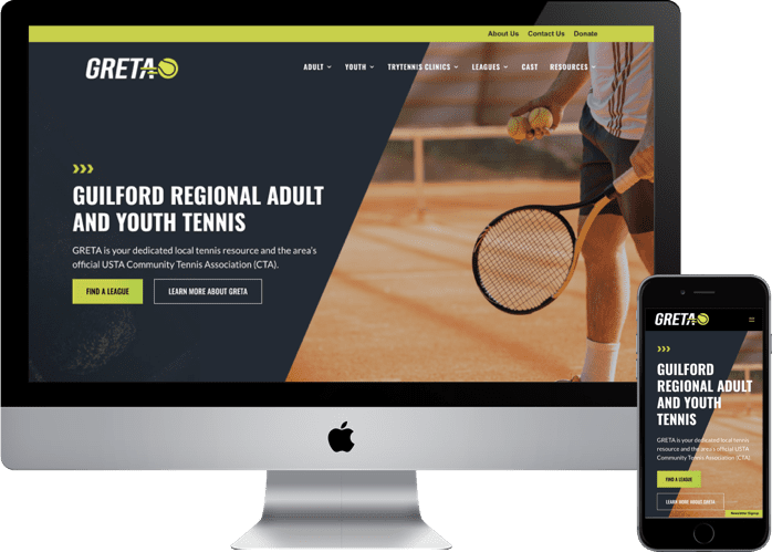
As part of the key benefits to responsive design, the website does not adjust to a fixed size but is flexible to adjust between screen resolution ranges to present the optimal viewing experience for the end-user. This means you will only have one site to manage (rather than having a desktop and mobile site). This also erases any duplicate content issues between desktop and mobile devices, which helps SEO.
According to Infront WebWorks, increasing your website loading speed can prevent that loss of 7% in possible conversions due to slow sites. In addition, 72% of people desire mobile-friendly websites, and remarketing your site to accommodate these features will result in much higher conversions.
Technology continues to provide new mobile devices, tablets, computers, and smart devices with varying screen dimensions and user requirements. These factors alone are reason enough to use responsive design, which is why it is our standard practice for web design and development.

As a responsive design agency, browse through several of our responsive design websites above or contact us today to discuss whether a responsive web solution is appropriate for your business needs.
LEARNING CENTER
WEB AND GRAPHIC DESIGN
GENERAL DESIGN
WEB-BASED DESIGN
- Responsive Website Design
- WordPress Website Design
- Landing Page Design
- Email Template Design
- Digital Banner Ad Design
ECOMMERCE
- Shopify Website Design
- WooCommerce Design
- Volusion Website Design
- Ecommerce UX/UI Design
MARKETING CHANNELS
DIGITAL MARKETING
- Search Marketing
- Email Marketing
- Social Media Marketing
- Mobile Marketing
- Content Marketing
- Marketing Automation
- Remarketing
- Geo-Fencing
TRADITIONAL
STRATEGIC MARKETING
- Google Analytics
- Call Tracking Solutions
- Sales Analytics
- Marketing Consulting
- Sales Consulting
LOCAL SERVICES
GREENSBORO
- Greensboro Web Design
- Greensboro B2B Web Design
- Greensboro E-commerce Development
- Greensboro Web Marketing
- Greensboro SEO Services
- Greensboro website maintenance
- Greensboro Google Ads